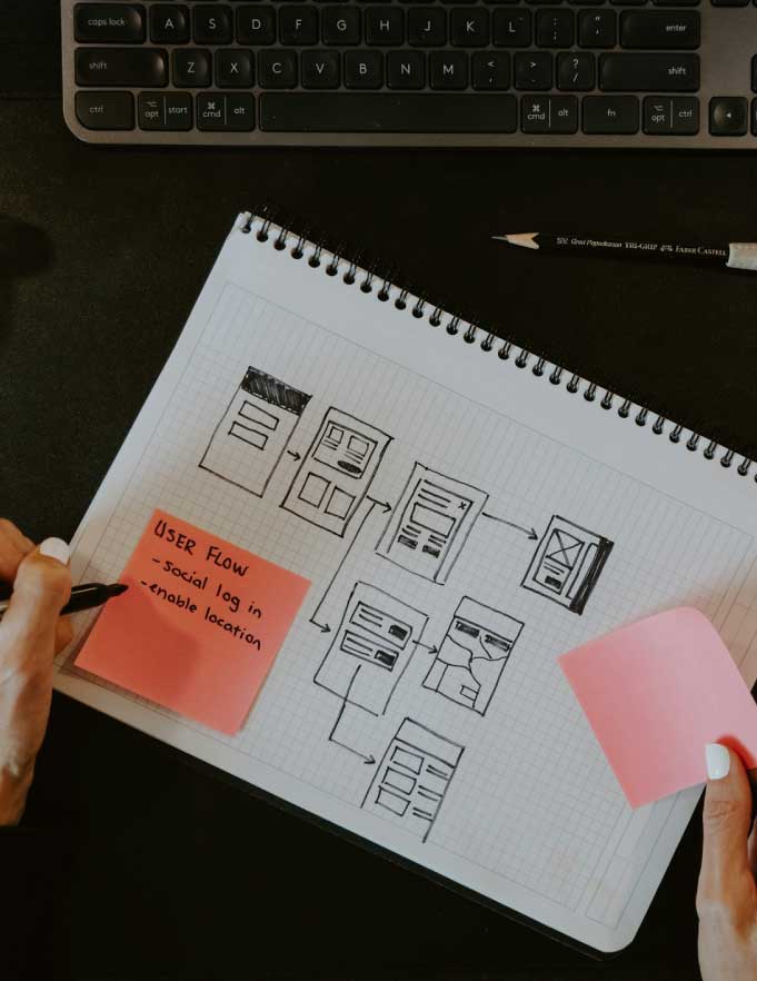
Remember the last time you lost something? How frustrating and time consuming the search was? Searching for information on the Internet can feel the same way. How many times have you gone to a website looking for one simple piece of information and you end up saying ?nevermind? because the website?s navigation is just too confusing. You know the information exists, but you don?t have the time or patience to continue searching. So you do what every other person with an internet connection does: you Google it to find another company that offers the same products and/or services.
A recent survey by AnswerDash reveals how and why we leave websites:
- 75 percent of people 18 to 24 years old and 57 percent of those 55 and over abandon a site within two minutes if they can?t find what they need.
- Of those over age 55, 28 percent said they spend only 4 minutes trying to accomplish their task on a website before leaving.
- Across all age groups, average abandonment time is 90 seconds.
Here’s another informative statistic: 57 percent of web users will abandon a site as soon as they have a question without a ready answer.
For small business owners, this means two things. First, a website is a must. Second, when building your website, you need to think like a customer and understand best practices for web development, design, search engine optimization (SEO), and user experience (UX).
Help customers navigate
For any new business, the company?s online presence needs to be topnotch. Basic functionality should never be an issue, and content should be fresh and up-to-date. Sites that are most inviting are clean and flow logically.
Here are eight keys to consider when creating your new site:
- Timeliness. Your site needs to be current and updated. Consider blogs, forums, or other tools that are updated regularly with new and engaging content.
- Navigation. Keep navigation organized and straightforward. Consider grouping similar navigation items together. If your site is going to have more than six pages, consider a sitemap. (For SEO, you will likely want a sitemap anyway. We?ll cover that in a later post.)
- Simplicity. Content should be concise and easy to find, preferably not across multiple pages. No one wants to click through 10 different pages to find that one piece of information they need. As with navigation tools, group similar pieces of content together. Use headings and highlighting to set content apart. Also, within the article, DO link to relevant content. For example, if you mention tips to design a great logo (https://atbrand.com/branding/design-a-logo), you?ll want to provide a link to easily access that content.
- Engagement. If users are bored, they will not stay long and they will not come back. Make sure the site is clean but still eye-catching. Add interactive elements where they make sense?don?t force them.
- Structure. While the site shouldn?t be so bland that users don?t remember it, don?t stray too far in the opposite direction and make the site outlandish. If it?s in your budget, hire a designer who can help you choose the right colors, fonts, and design elements to make your site unique and attractive.
- Optional audio and video. Using audio and video on your website can be engaging, but let the user choose what he or she wants to see or hear?do not start audio and video streaming as soon as the user arrives. And be mindful that audio and video can use more resources, which may require you to select a more advanced (and more expensive) web hosting service, or your site may load slowly.
- Registration as a barricade. You need a good reason to force users to register to use your site. If the site has a customer portal, then registration makes sense. However, having users register just to browse the site is a barrier, telling them only certain users are welcome.
- Ad overkill. Using advertising appropriately can be a legitimate income-generator for your business. However, advertising in excess can be distracting and frustrating. Users want to review your content without ads popping up all over. An ad should not be the first thing a user sees, nor should ad space outweigh content space.
Information courtesy of Kissmetrics.
One last note
Your website should be informative; try to anticipate users? questions and provide them with answers. However, when users have questions you have not considered, make sure your ?help? tool is portrayed as just that?your company?s offer to help and not a secret society for only the most technologically savvy customers to find.
Remember, the most important thing to do when building a website is to help users find answers. Do this, and do it well, and you will give yourself a great chance to earn more business.
